Step 4: Adding a Visualization Node
The Visualization Node is the final step in most Data Functions. Its purpose is to take the processed data from the preceding Logic or Predefined Node and display it in a chosen format: either a Table, a Bar Chart, or a Line Chart.
This node determines how the results of your function will be presented when you run it later.
Adding the Node
-
Open the "Add Block" Menu: In the Function Builder Dialog, click "Add Block".
-
Select "Visualization": Choose "Visualization" from the menu.
-
A new Visualization node will appear on the canvas.
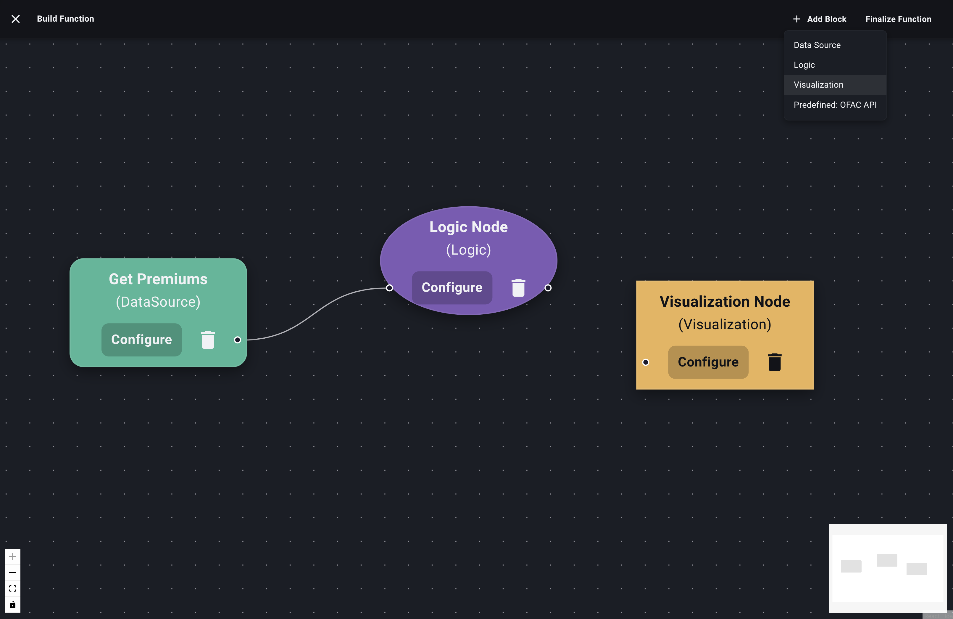
Add Visualization Node -
Connect Input Node: Connect the output handle of the preceding Logic or Predefined Node to the input handle of the Visualization Node. A Visualization Node must have an input connected before configuration.
Configuring the Visualization Node
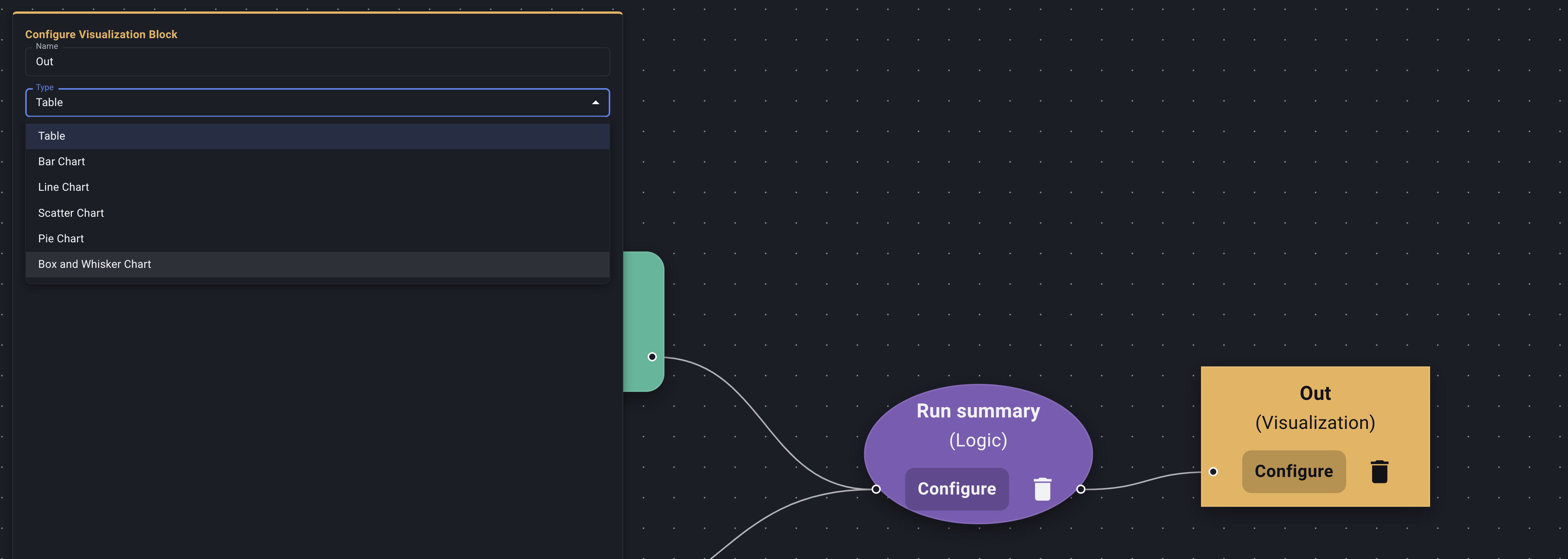
- Open Configuration: Click the "Configure" button on the Visualization Node.
- The Visualization Block Configuration panel or dialog will appear.
- Name (Optional but Recommended): Give this output a title (e.g., "Loss Ratio Trend", "Premiums by State Table", "Claim Counts Over Time").
- Select Visualization Type: Choose the desired output format from the dropdown:
- Table
- Bar Chart
- Line Chart
- Pie Chart
- Box and Whisker Chart
- Scatter Chart
Configuring a Table Visualization
- If you selected "Table", no further configuration is needed. The node will simply display the data table it receives from the input node.
- Click "Save".
Configuring Charts (AI Assistance)
Creating effective charts often requires selecting the right columns for axes and values, which can sometimes be complex depending on the output structure of your Logic node. Decode uses AI assistance for this.
-
Select Chart Type: Choose one of the permitted chart types.
-
Interact with AI: Similar to the Logic Node, a chat interface will appear.
- Initial Prompt: Start by telling the AI what you want to plot. Be specific about which columns from the input data should be used for the X-axis, Y-axis, and potentially different series (for line charts).
- Examples:
- (For Bar Chart): "Create a bar chart showing the 'Total Net Premium' for each 'Wholesaler Name'."
- (For Line Chart): "Plot the 'Loss Ratio' over time using the 'Report Month' column for the x-axis."
- (For Line Chart with multiple lines): "Plot 'Gross Premium' and 'Net Premium' as separate lines over time, using 'Month' for the x-axis."
- Send Message: Send your instructions to the AI.
-
AI Processing & Chart Preview:
- The AI interprets your request, generates the necessary configuration to map the input data columns to the chart structure, and potentially performs minor data restructuring if needed (like pivoting).
- A Chart Preview will be displayed within the configuration panel, showing how the chart will look based on the sample data from the input node.
Configure Visualization Node -
Review and Iterate:
- Examine the Chart Preview. Is it displaying the data correctly? Are the axes labeled appropriately? Are the lines/bars representing the right things?
- If it's not right, chat further with the AI. Provide corrections or refinements.
- Example Corrections: "Use 'Region' on the x-axis instead." or "Label the Y-axis 'Total Premium ($)'." or "Make the bars blue."
- Continue iterating until the chart preview accurately reflects the visualization you need.
-
Save: When satisfied with the chart configuration achieved through the AI interaction, click "Save".
Your Visualization Node is now configured to display the results of your Data Function in the chosen format. This is typically the final node in a function pipeline.
The last step in building the basic structure is Connecting Nodes.